

01. The Brief
Save us from our website nightmare.
I remember the first time the client briefed us on this. I went and checked out their current website. I was horrified to see some nightmarish flash animation movie of some garish cartoon character walking unsteadily to the counter and ordering some food. The entire thing was one flash movie.

02. The Plan
Create a new website for McDonald’s Korea that used a regional integrated back end CMS built in Drupal that reflected the new global “Bold and Simple” brand style.
At the same time McDonald’s in the APAC region was beginning to get the consolidation and integration itch. They wanted to stop having each market do their own thing, and implement brand consistency like they have in the restaurants. We reached out to our sister agency at DDB NZ and worked with them to bring their back end system into Korea. Easier said than done. There was still a massive amount of design work, testing, and coding to be done. Korean ISPs aren’t structured the same so we needed to test out server infrastructure, code compatibility to make sure their versions of Drupal were compatible. We had to remake the DB and run it on high traffic server racks to ensure stability and load balancing.
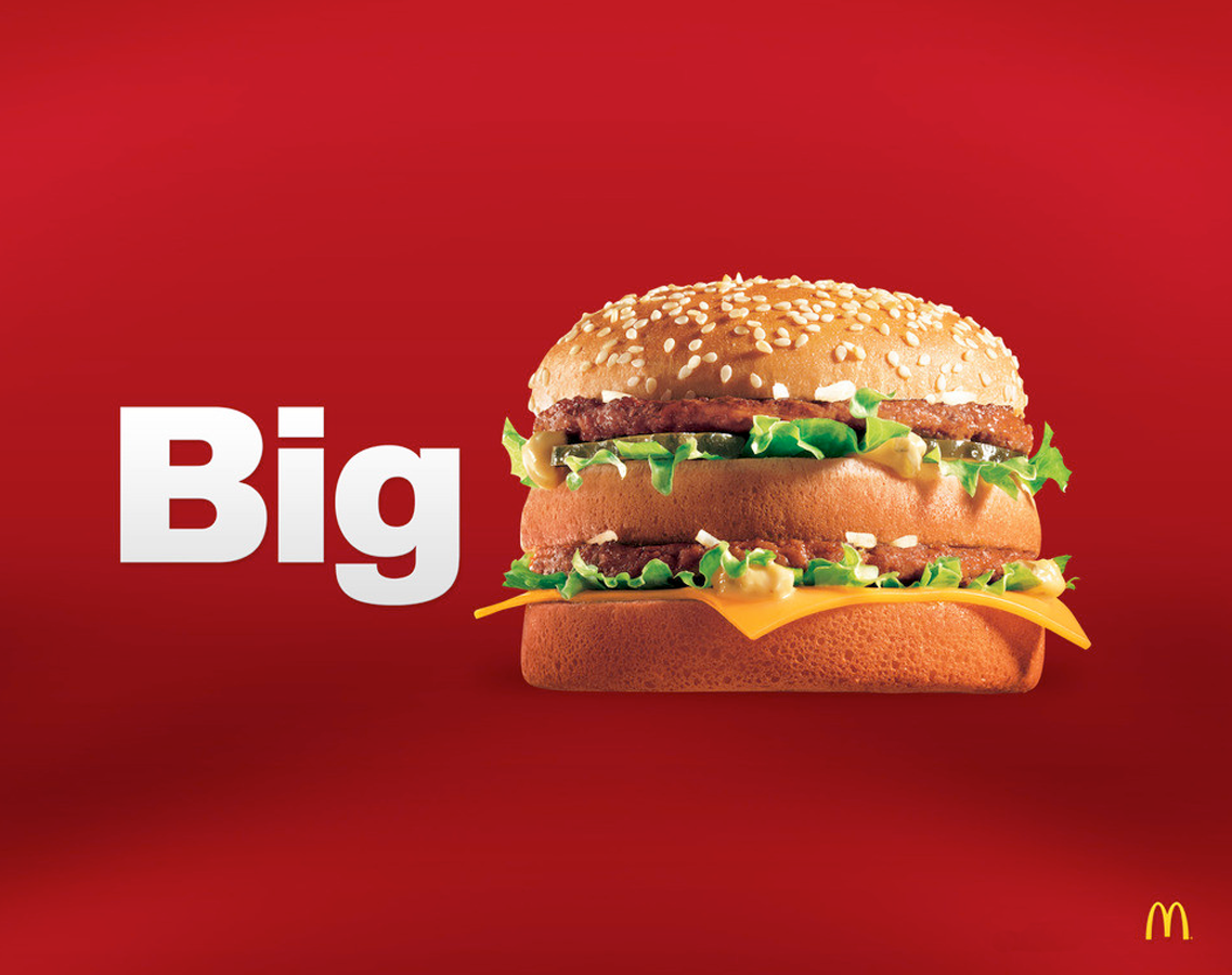
Then we did an online ad/PR campaign to let people know we had a new website. The website was the face to the customers, we knew that we wanted to radically change the branding to fit McDonald’s new simple and bold style. Food had to return to the front and center so we got the best food photos we could and transformed all of our design work with larger than life food photos.


